Pricing Model Selection
Using one dataset to learn and predict on the other
DRAFT - UNFINISHED
Client request
Here is an excel file with 2 data sets. This is actual data.
The first data set is a standard correlation where the baseline and benchmark show a strong correlation according to my simple method The second data set is an example where the correlation is good, until it is not for a period of 12 months or so, before the lines come back together. This was caused by a disruption by a fire at one supplier after which capacity was limited and the link between market pricing and cost driver pricing was no longer relevant
Some notes The 2 data sets which I am running my analysis on are shaded in blue. I have added the formulas so you can see how they are calculated from the underlying data sets. Some of the data preparation (averaging, adjusting for lag, FX conversion) is not visible in this file but it is not so relevant for the statistics.
I would love to know if there is a better way to: - Understand or analyse the correlation between the 2 main lines - Understand the correlation between the base line and each of the individual cost drivers so that the cost drivers could be ranked in terms of relevance in some way
I am available to answer any questions about this data.
Read in necessary packages
[1]:
import pandas as pd
import numpy as np
import matplotlib.pyplot as plt
import seaborn as sns

from jmspack.utils import (apply_scaling,
                          JmsColors)
from jmspack.ml_utils import plot_confusion_matrix, plot_learning_curve, dict_of_models
from jmspack.frequentist_statistics import correlation_analysis

# from dtw import *
from sklearn.linear_model import LinearRegression
from sklearn.ensemble import RandomForestRegressor
from sklearn.model_selection import KFold
from sklearn.metrics import mean_squared_error
import shap
/Users/james/miniconda3/envs/ds_env/lib/python3.9/site-packages/tqdm/auto.py:22: TqdmWarning: IProgress not found. Please update jupyter and ipywidgets. See https://ipywidgets.readthedocs.io/en/stable/user_install.html
  from .autonotebook import tqdm as notebook_tqdm
[2]:
shap.initjs()

Set plotting style
[3]:
if "jms_style_sheet" in plt.style.available:
    plt.style.use("jms_style_sheet")
Read in data frames
[4]:
df_train = (pd.read_excel("data/Input for statistics v1.xlsx", sheet_name=0)
    .assign(**{"Date": lambda x: pd.to_datetime(x["Date"]).dt.date})
    .dropna()
    .set_index("Date")
)
df_test = (pd.read_excel("data/Input for statistics v1.xlsx", sheet_name=1)
    .assign(**{"Date": lambda x: pd.to_datetime(x["Date"]).dt.date})
    .dropna()
    .set_index("Date")
    )
Show the head of the data frame
[5]:
df_train.head(); df_test.head()
[5]:
| Baseline | Weighted benchmark | Benchmark index | Chlorine | Benzene | Aluminium | |
|---|---|---|---|---|---|---|
| Date | ||||||
| 2017-04-01 | 1.068 | 1.06685 | 1.121545 | 1.099 | 1.013 | 1.239 |
| 2017-05-01 | 1.087 | 1.07005 | 1.127364 | 1.099 | 1.006 | 1.265 |
| 2017-06-01 | 1.087 | 1.07815 | 1.142091 | 1.099 | 1.087 | 1.265 |
| 2017-07-01 | 1.087 | 1.07765 | 1.141182 | 1.093 | 1.142 | 1.237 |
| 2017-08-01 | 1.087 | 1.07565 | 1.137545 | 1.069 | 1.188 | 1.241 |
Define the target and display simple summary statistics of the columns
[6]:
target = "Baseline"
[7]:
display(df_train.describe()); df_test.describe()
| Baseline | Weighted benchmark | Benchmark index | EHA | Acrylic Acid | Styrene | |
|---|---|---|---|---|---|---|
| count | 56.000000 | 56.000000 | 56.000000 | 56.000000 | 56.000000 | 56.000000 |
| mean | 1.012518 | 0.999170 | 0.998616 | 1.139804 | 1.123946 | 0.865357 |
| std | 0.099634 | 0.113010 | 0.188350 | 0.264228 | 0.219361 | 0.183202 |
| min | 0.862000 | 0.825250 | 0.708750 | 0.846000 | 0.846000 | 0.499000 |
| 25% | 0.944750 | 0.937937 | 0.896562 | 0.935000 | 0.983750 | 0.770250 |
| 50% | 1.002500 | 0.980200 | 0.967000 | 1.030500 | 1.064000 | 0.933500 |
| 75% | 1.056250 | 1.055350 | 1.092250 | 1.360500 | 1.174500 | 1.003000 |
| max | 1.176000 | 1.208800 | 1.348000 | 1.664000 | 1.624000 | 1.193000 |
[7]:
| Baseline | Weighted benchmark | Benchmark index | Chlorine | Benzene | Aluminium | |
|---|---|---|---|---|---|---|
| count | 60.000000 | 60.000000 | 60.000000 | 60.000000 | 60.000000 | 60.000000 |
| mean | 1.070700 | 1.032053 | 1.058279 | 1.031233 | 1.062683 | 1.109433 |
| std | 0.043434 | 0.038837 | 0.070612 | 0.084605 | 0.093602 | 0.102285 |
| min | 0.997000 | 0.952650 | 0.913909 | 0.894000 | 0.787000 | 0.863000 |
| 25% | 1.039250 | 1.006787 | 1.012341 | 0.985000 | 1.004500 | 1.037500 |
| 50% | 1.066500 | 1.038575 | 1.070136 | 1.029000 | 1.088500 | 1.135500 |
| 75% | 1.087000 | 1.050563 | 1.091932 | 1.064000 | 1.121750 | 1.194000 |
| max | 1.160000 | 1.143200 | 1.260364 | 1.371000 | 1.216000 | 1.265000 |
Plot the amount of rows in the target
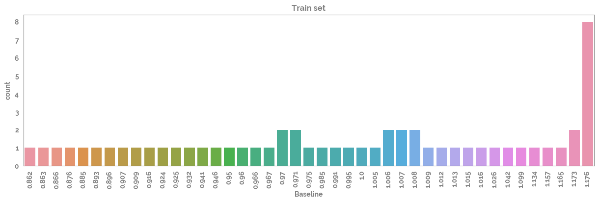
[8]:
_ = plt.figure(figsize=(15, 4))
_ = sns.countplot(x=df_train[target])
_ = plt.xticks(rotation=90)
_ = plt.title("Train set")
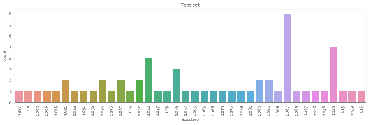
[9]:
_ = plt.figure(figsize=(15, 4))
_ = sns.countplot(x=df_test[target])
_ = plt.xticks(rotation=90)
_ = plt.title("Test set")
Plot the heatmaps of the raw and scaled data
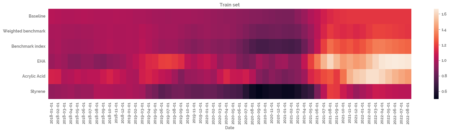
[10]:
_ = plt.figure(figsize=(20, 4))
_ = sns.heatmap(df_train
                # .drop(target, axis=1)
                .T
)
_ = plt.title("Train set")
[11]:
_ = plt.figure(figsize=(20, 4))
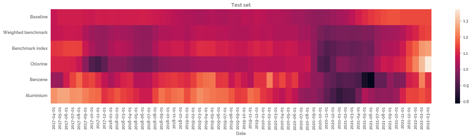
_ = sns.heatmap(df_test
# .drop(target, axis=1)
.T
)
_ = plt.title("Test set")
Plot the correlation of all of the different time series with each other
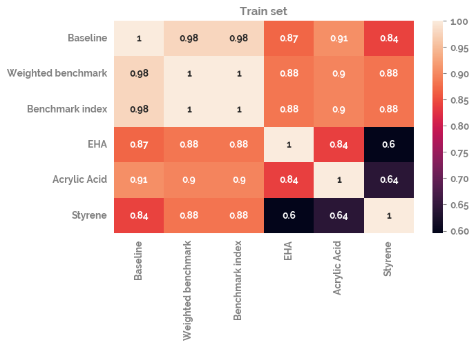
[12]:
_ = plt.figure(figsize=(7, 4))
_ = sns.heatmap(df_train.corr(), annot=True)
_ = plt.title("Train set")
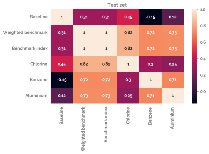
[13]:
_ = plt.figure(figsize=(7, 4))
_ = sns.heatmap(df_test.corr(), annot=True)
_ = plt.title("Test set")
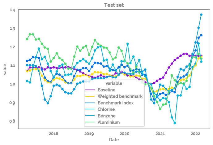
Plot all of the features over time
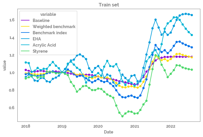
[14]:
_ = plt.figure(figsize=(8, 5))
_ = sns.lineplot(data=df_train
                .reset_index()
                .melt(id_vars="Date"),
                x="Date",
                y="value",
                hue="variable"
                )

_ = sns.scatterplot(data=df_train
                .reset_index()
                .melt(id_vars="Date"),
                x="Date",
                y="value",
                hue="variable",
                legend=False
                )
_ = plt.title("Train set")
[15]:
_ = plt.figure(figsize=(8, 5))
_ = sns.lineplot(data=df_test
                .reset_index()
                .melt(id_vars="Date"),
                x="Date",
                y="value",
                hue="variable"
                )

_ = sns.scatterplot(data=df_test
                .reset_index()
                .melt(id_vars="Date"),
                x="Date",
                y="value",
                hue="variable",
                legend=False
                )
_ = plt.title("Test set")
[16]:
X = df_train.drop(target,axis=1)
y = df_train[target]

X.shape, y.shape
[16]:
((56, 5), (56,))
[17]:
mod = RandomForestRegressor(random_state=42)
# mod = LinearRegression(fit_intercept=True)
[18]:
_ = mod.fit(X, y)
y_pred = mod.predict(X)
df_test = pd.DataFrame({"y_pred": y_pred, target: y})
[19]:
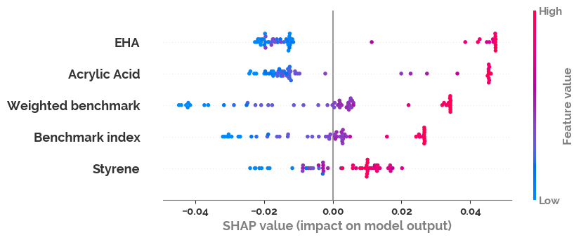
if mod.__class__.__name__ != "LinearRegression":
    explainer = shap.Explainer(mod)
    shap_values = explainer(X)
    shap.plots.beeswarm(shap_values)
No data for colormapping provided via 'c'. Parameters 'vmin', 'vmax' will be ignored
[20]:
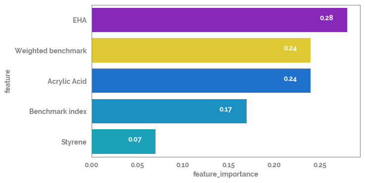
feature_importance = pd.Series(dict(zip(X.columns, mod.feature_importances_.round(2))))
feature_importance_df = pd.DataFrame(feature_importance.sort_values(ascending=False)).reset_index().rename(columns={"index": "feature", 0: "feature_importance"})
_ = plt.figure(figsize=(7, 4))
_ = sns.barplot(data=feature_importance_df, x="feature_importance", y="feature")
for i in feature_importance_df.index:
    _ = plt.text(x=feature_importance_df.loc[i, "feature_importance"]-0.03,
                y=i,
                s=feature_importance_df.loc[i, "feature_importance"],
                color="white")
[21]:
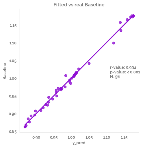
dict_results = correlation_analysis(data=df_test,
                     col_list=["y_pred"],
                     row_list=[target],
                     check_norm=True,
                     method = 'pearson',
                     dropna = 'pairwise')
cors_df=dict_results["summary"]

r_value = cors_df["r-value"].values[0].round(3)
p_value = cors_df["p-value"].values[0].round(3)
if p_value < 0.001:
    p_value = "< 0.001"
n = cors_df["N"].values[0].round(3)

cors_df
The frame.append method is deprecated and will be removed from pandas in a future version. Use pandas.concat instead.
[21]:
| analysis | feature1 | feature2 | r-value | p-value | stat-sign | N | |
|---|---|---|---|---|---|---|---|
| 0 | Spearman Rank | y_pred | Baseline | 0.993958 | 1.658809e-53 | True | 56 |
[22]:
_ = sns.lmplot(data=df_test,
               x="y_pred",
               y=target)
_ = plt.annotate(text=f"r-value: {r_value}\np-value: {p_value}\nN: {n}", xy=(1.11,1))
_ = plt.title(f"Fitted vs real {target}")
[23]:
# import sklearn
# sorted(sklearn.metrics.SCORERS.keys())
[24]:
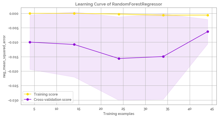
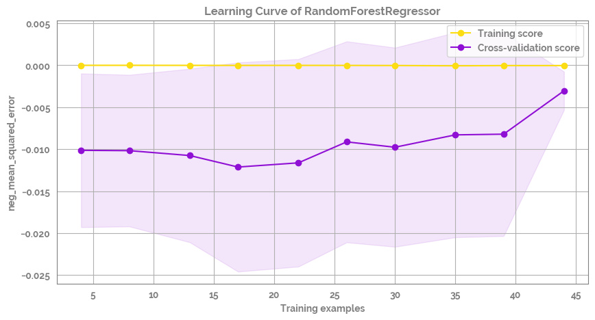
fig = plot_learning_curve(estimator=mod,
                          title=f'Learning Curve of {mod.__class__.__name__}',
                          X=X,
                          y=y,
                          groups=None,
                          cross_color=JmsColors.PURPLE,
                          test_color=JmsColors.YELLOW,
                          scoring='neg_mean_squared_error', #'r2'
                          ylim=None,
                          cv=None,
                          n_jobs=10,
                          train_sizes=np.linspace(.1, 1.0, 10),
                          figsize=(10,5))
Plot the difference between real and precited and the correlation between real and predicted
Redefine X to just use the top feature (in an attempt to stop overfitting)
[25]:
X = df_train[[feature_importance_df.loc[0, "feature"]]]
[26]:
kfold = KFold(n_splits=2, shuffle=True, random_state=1)
for train_ix, test_ix in kfold.split(X):
# select rows
train_X, test_X = X.iloc[train_ix, :], X.iloc[test_ix, :]
train_y, test_y = y.iloc[train_ix], y.iloc[test_ix]
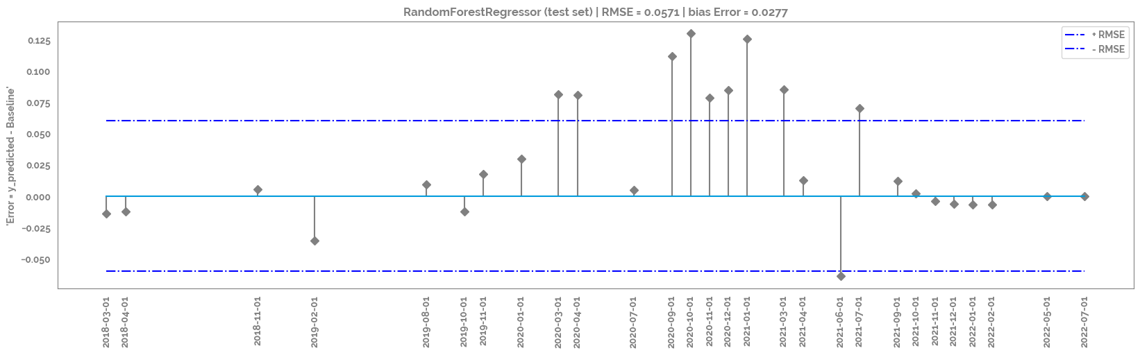
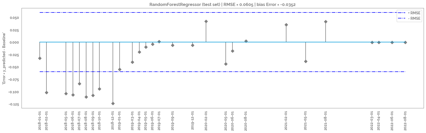
_ = mod.fit(X = train_X,
y = train_y)
y_pred = mod.predict(test_X)
df_test = pd.DataFrame({"y_pred": y_pred, target: test_y})
user_ids_first = df_test.head(1).index.tolist()[0]
user_ids_last = df_test.tail(1).index.tolist()[0]
_ = plt.figure(figsize=(20,5))
_ = plt.title(f"{mod.__class__.__name__} (test set) | RMSE = {round(np.sqrt(mean_squared_error(df_test['y_pred'], df_test[target])),4)} | bias Error = {round(np.mean(df_test['y_pred'] - df_test[target]), 4)}")
rmse_plot = plt.stem(df_test.index, df_test['y_pred'] - df_test[target], use_line_collection=True, linefmt='grey', markerfmt='D')
_ = plt.hlines(y=round(np.sqrt(mean_squared_error(df_test['y_pred'], df_test[target])),2), colors='b', linestyles='-.', label='+ RMSE',
xmin = user_ids_first,
xmax = user_ids_last
)
_ = plt.hlines(y=round(-np.sqrt(mean_squared_error(df_test['y_pred'], df_test[target])),2), colors='b', linestyles='-.', label='- RMSE',
xmin = user_ids_first,
xmax = user_ids_last
)
_ = plt.xticks(rotation=90, ticks=df_test.index)
_ = plt.ylabel(f"'Error = y_predicted - {target}'")
_ = plt.legend()
_ = plt.show()
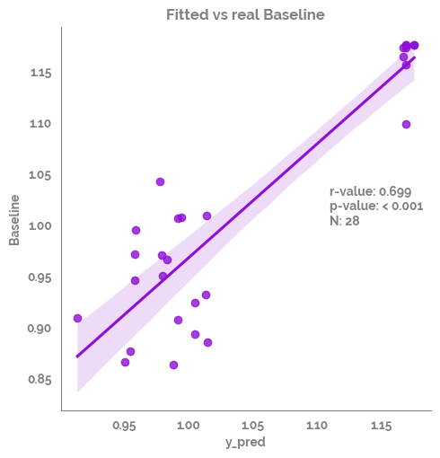
dict_results = correlation_analysis(data=df_test,
col_list=["y_pred"],
row_list=[target],
check_norm=True,
method = 'pearson',
dropna = 'pairwise')
cors_df=dict_results["summary"]
r_value = cors_df["r-value"].values[0].round(3)
p_value = cors_df["p-value"].values[0].round(3)
if p_value < 0.001:
p_value = "< 0.001"
n = cors_df["N"].values[0].round(3)
display(cors_df)
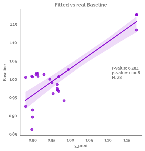
_ = sns.lmplot(data=df_test,
x="y_pred",
y=target)
_ = plt.annotate(text=f"r-value: {r_value}\np-value: {p_value}\nN: {n}", xy=(1.11,1))
_ = plt.title(f"Fitted vs real {target}")
_ = plt.show()
The 'use_line_collection' parameter of stem() was deprecated in Matplotlib 3.6 and will be removed two minor releases later. If any parameter follows 'use_line_collection', they should be passed as keyword, not positionally.
The frame.append method is deprecated and will be removed from pandas in a future version. Use pandas.concat instead.
| analysis | feature1 | feature2 | r-value | p-value | stat-sign | N | |
|---|---|---|---|---|---|---|---|
| 0 | Spearman Rank | y_pred | Baseline | 0.698887 | 0.000035 | True | 28 |
The 'use_line_collection' parameter of stem() was deprecated in Matplotlib 3.6 and will be removed two minor releases later. If any parameter follows 'use_line_collection', they should be passed as keyword, not positionally.
The frame.append method is deprecated and will be removed from pandas in a future version. Use pandas.concat instead.
| analysis | feature1 | feature2 | r-value | p-value | stat-sign | N | |
|---|---|---|---|---|---|---|---|
| 0 | Spearman Rank | y_pred | Baseline | 0.493671 | 0.007591 | True | 28 |
[27]:
fig = plot_learning_curve(estimator=mod,
                          title=f'Learning Curve of {mod.__class__.__name__}',
                          X=X,
                          y=y,
                          groups=None,
                          cross_color=JmsColors.PURPLE,
                          test_color=JmsColors.YELLOW,
                          scoring='neg_mean_squared_error', #'r2'
                          ylim=None,
                          cv=None,
                          n_jobs=10,
                          train_sizes=np.linspace(.1, 1.0, 5),
                          figsize=(10,5))