PIMA diabetes Exploratory Data Analysis
[1]:
import pandas as pd
import numpy as np
import matplotlib.pyplot as plt
import seaborn as sns

from jmspack.utils import (apply_scaling,
                          JmsColors)
[2]:
if "jms_style_sheet" in plt.style.available:
    plt.style.use("jms_style_sheet")
[3]:
df = pd.read_csv("diabetes.csv")
[4]:
df.head()
[4]:
| Pregnancies | Glucose | BloodPressure | SkinThickness | Insulin | BMI | DiabetesPedigreeFunction | Age | Outcome | |
|---|---|---|---|---|---|---|---|---|---|
| 0 | 6 | 148 | 72 | 35 | 0 | 33.6 | 0.627 | 50 | 1 |
| 1 | 1 | 85 | 66 | 29 | 0 | 26.6 | 0.351 | 31 | 0 |
| 2 | 8 | 183 | 64 | 0 | 0 | 23.3 | 0.672 | 32 | 1 |
| 3 | 1 | 89 | 66 | 23 | 94 | 28.1 | 0.167 | 21 | 0 |
| 4 | 0 | 137 | 40 | 35 | 168 | 43.1 | 2.288 | 33 | 1 |
[5]:
target = "Outcome"
[6]:
df.describe()
[6]:
| Pregnancies | Glucose | BloodPressure | SkinThickness | Insulin | BMI | DiabetesPedigreeFunction | Age | Outcome | |
|---|---|---|---|---|---|---|---|---|---|
| count | 768.000000 | 768.000000 | 768.000000 | 768.000000 | 768.000000 | 768.000000 | 768.000000 | 768.000000 | 768.000000 |
| mean | 3.845052 | 120.894531 | 69.105469 | 20.536458 | 79.799479 | 31.992578 | 0.471876 | 33.240885 | 0.348958 |
| std | 3.369578 | 31.972618 | 19.355807 | 15.952218 | 115.244002 | 7.884160 | 0.331329 | 11.760232 | 0.476951 |
| min | 0.000000 | 0.000000 | 0.000000 | 0.000000 | 0.000000 | 0.000000 | 0.078000 | 21.000000 | 0.000000 |
| 25% | 1.000000 | 99.000000 | 62.000000 | 0.000000 | 0.000000 | 27.300000 | 0.243750 | 24.000000 | 0.000000 |
| 50% | 3.000000 | 117.000000 | 72.000000 | 23.000000 | 30.500000 | 32.000000 | 0.372500 | 29.000000 | 0.000000 |
| 75% | 6.000000 | 140.250000 | 80.000000 | 32.000000 | 127.250000 | 36.600000 | 0.626250 | 41.000000 | 1.000000 |
| max | 17.000000 | 199.000000 | 122.000000 | 99.000000 | 846.000000 | 67.100000 | 2.420000 | 81.000000 | 1.000000 |
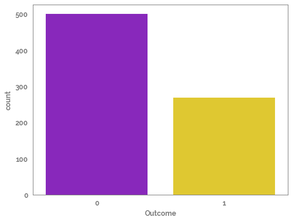
Plot the amount of rows in each side of the target
Looks like the target is imbalanced so this needs to be taken into account
[7]:
_ = sns.countplot(x=df[target])
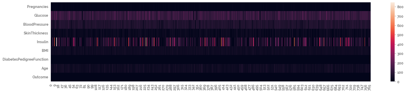
[8]:
_ = plt.figure(figsize=(20, 4))
_ = sns.heatmap(df.T)
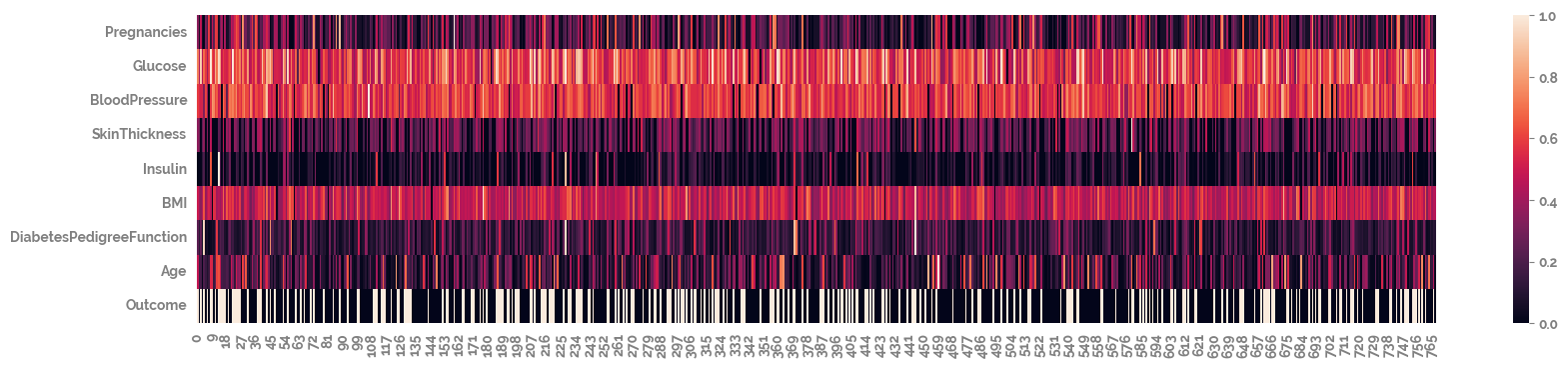
[9]:
_ = plt.figure(figsize=(20, 4))
_ = sns.heatmap(df
                .pipe(apply_scaling)
                .T)
[10]:
_ = plt.figure(figsize=(7, 4))
_ = sns.heatmap(df.corr(), annot=True)
[11]:
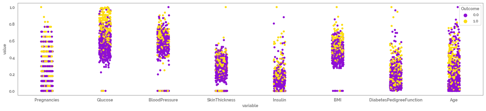
_ = plt.figure(figsize=(20, 4))
_ = sns.stripplot(data=df
                .pipe(apply_scaling, "MinMax")
                .melt(id_vars = target),
                x = "variable",
                y = "value",
                hue = target,)
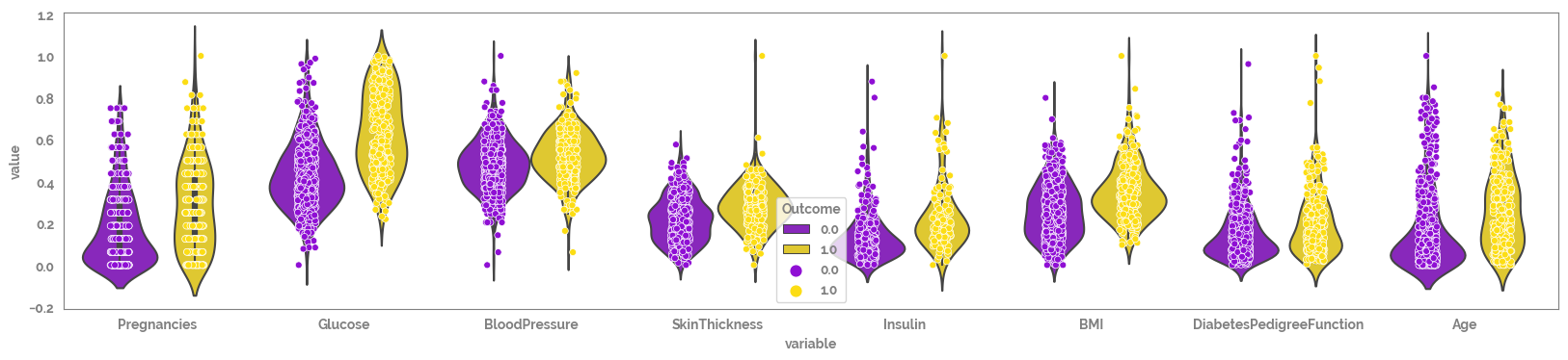
[12]:
_ = plt.figure(figsize=(20, 4))
_ = sns.violinplot(data=df
                .pipe(apply_scaling, "MinMax")
                .melt(id_vars = target),
                x = "variable",
                y = "value",
                hue = target,
               )
_ = sns.stripplot(data=df
                .pipe(apply_scaling, "MinMax")
                .melt(id_vars = target),
                x = "variable",
                y = "value",
                hue = target,
                edgecolor='white',
    linewidth=0.5,
                  dodge=True
               )
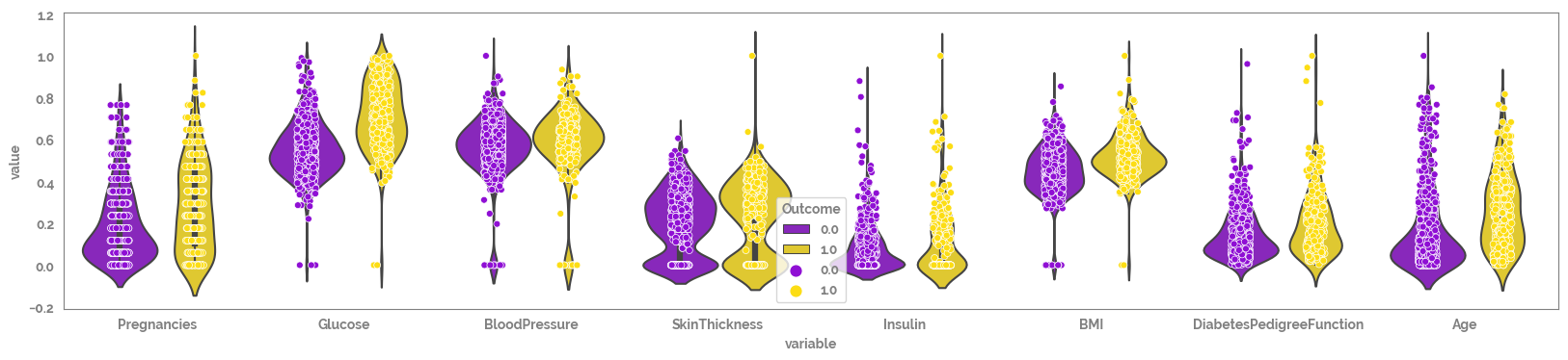
Looking at the scatter plots there seems like there may be some missing values with default value = 0, that need to be removed prior to analysis (e.g. BMI).
[13]:
tmp = (df
       .drop(target, axis=1)
       .replace(0, np.nan)
       .merge(df[target], left_index=True, right_index=True)
       .pipe(apply_scaling, "MinMax")
       .melt(id_vars = target)
      )
[14]:
_ = plt.figure(figsize=(20, 4))
_ = sns.violinplot(data=tmp,
                x = "variable",
                y = "value",
                hue = "Outcome",
               )

_ = sns.stripplot(data=tmp,
                x = "variable",
                y = "value",
                hue = target,
                edgecolor='white',
    linewidth=0.5,
                  dodge=True
               )