PIMA diabetes looking into different sampling options
[1]:
import pandas as pd
import numpy as np
import matplotlib.pyplot as plt
import seaborn as sns

from jmspack.utils import (apply_scaling,
                          JmsColors)
from imblearn.over_sampling import (SMOTE,
                                    ADASYN,
                                    BorderlineSMOTE,
                                    SVMSMOTE,
                                    KMeansSMOTE
                                   )
[2]:
if "jms_style_sheet" in plt.style.available:
    plt.style.use("jms_style_sheet")
[3]:
df = pd.read_csv("diabetes.csv")
[4]:
df.head()
[4]:
| Pregnancies | Glucose | BloodPressure | SkinThickness | Insulin | BMI | DiabetesPedigreeFunction | Age | Outcome | |
|---|---|---|---|---|---|---|---|---|---|
| 0 | 6 | 148 | 72 | 35 | 0 | 33.6 | 0.627 | 50 | 1 |
| 1 | 1 | 85 | 66 | 29 | 0 | 26.6 | 0.351 | 31 | 0 |
| 2 | 8 | 183 | 64 | 0 | 0 | 23.3 | 0.672 | 32 | 1 |
| 3 | 1 | 89 | 66 | 23 | 94 | 28.1 | 0.167 | 21 | 0 |
| 4 | 0 | 137 | 40 | 35 | 168 | 43.1 | 2.288 | 33 | 1 |
[5]:
target = "Outcome"
[6]:
df.describe()
[6]:
| Pregnancies | Glucose | BloodPressure | SkinThickness | Insulin | BMI | DiabetesPedigreeFunction | Age | Outcome | |
|---|---|---|---|---|---|---|---|---|---|
| count | 768.000000 | 768.000000 | 768.000000 | 768.000000 | 768.000000 | 768.000000 | 768.000000 | 768.000000 | 768.000000 |
| mean | 3.845052 | 120.894531 | 69.105469 | 20.536458 | 79.799479 | 31.992578 | 0.471876 | 33.240885 | 0.348958 |
| std | 3.369578 | 31.972618 | 19.355807 | 15.952218 | 115.244002 | 7.884160 | 0.331329 | 11.760232 | 0.476951 |
| min | 0.000000 | 0.000000 | 0.000000 | 0.000000 | 0.000000 | 0.000000 | 0.078000 | 21.000000 | 0.000000 |
| 25% | 1.000000 | 99.000000 | 62.000000 | 0.000000 | 0.000000 | 27.300000 | 0.243750 | 24.000000 | 0.000000 |
| 50% | 3.000000 | 117.000000 | 72.000000 | 23.000000 | 30.500000 | 32.000000 | 0.372500 | 29.000000 | 0.000000 |
| 75% | 6.000000 | 140.250000 | 80.000000 | 32.000000 | 127.250000 | 36.600000 | 0.626250 | 41.000000 | 1.000000 |
| max | 17.000000 | 199.000000 | 122.000000 | 99.000000 | 846.000000 | 67.100000 | 2.420000 | 81.000000 | 1.000000 |
Mask 0 default values (seen in EDA)
[7]:
df = (df.drop([target, "Pregnancies"], axis=1)
       .replace(0, np.nan)
       .merge(df[[target, "Pregnancies"]], left_index=True, right_index=True)
      .dropna()
     )
Plot the amount of rows in each side of the target
Looks like the target is imbalanced so this needs to be taken into account
[8]:
_ = sns.countplot(x=df[target])
print("Amount in each outcome")
df[target].value_counts()
Amount in each outcome
[8]:
0    262
1    130
Name: Outcome, dtype: int64
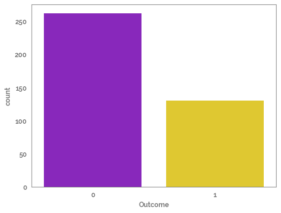
There are two main ways to take this imbalance into account, either by (re)-sampling the data to make the outcome amount equal, or by using a classifier which takes the imbalance into account in the model (usually known as a bagging classifier)
[9]:
feature_list = ["Glucose", "BMI"]
[10]:
sampling_options_dict = {"SMOTE": SMOTE(sampling_strategy="not majority",
                                        random_state=42,
                                        n_jobs=2),
                         "BorderlineSMOTE": BorderlineSMOTE(sampling_strategy="not majority",
                                        random_state=42,
                                        n_jobs=2),
                         "SVMSMOTE": SVMSMOTE(sampling_strategy="not majority",
                                        random_state=42,
                                        n_jobs=2),
                         "KMeansSMOTE": KMeansSMOTE(sampling_strategy="not majority",
                                        random_state=42,
                                        n_jobs=2),
                         "ADASYN": ADASYN(sampling_strategy="not majority",
                                        random_state=42,
                                        n_jobs=2),
                        }
[18]:
X = df.drop(target, axis=1)
y = df[target]
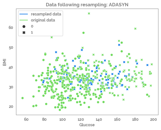
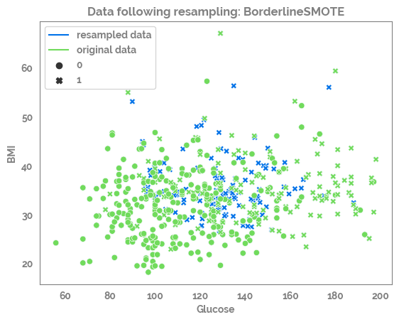
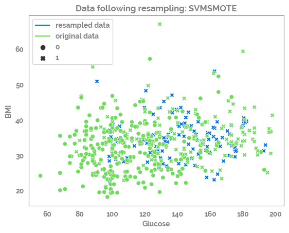
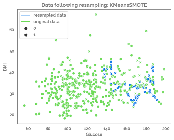
for samp_opt in sampling_options_dict:
print(samp_opt)
sm = sampling_options_dict[samp_opt]
X_res, y_res = sm.fit_resample(X, y)
print(X.shape, y.shape, X_res.shape, y_res.shape)
df_res = pd.concat([X_res, y_res], axis=1)
_ = sns.scatterplot(data=df_res,
x=feature_list[0],
y=feature_list[1],
color=JmsColors.DARKBLUE,
style=target)
_ = sns.scatterplot(data=df,
x=feature_list[0],
y=feature_list[1],
color=JmsColors.GREENYELLOW,
style=target,
legend=False)
_ = plt.plot(df_res[feature_list[0]].min(),
df_res[feature_list[1]].min(),
c=JmsColors.DARKBLUE,
label = "resampled data")
_ = plt.plot(df_res[feature_list[0]].min(),
df_res[feature_list[1]].min(),
c=JmsColors.GREENYELLOW,
label = "original data")
_ = plt.legend()
_ = plt.title(f"Data following resampling: {samp_opt}")
_ = plt.show()
SMOTE
(392, 8) (392,) (524, 8) (524,)
BorderlineSMOTE
(392, 8) (392,) (524, 8) (524,)
SVMSMOTE
(392, 8) (392,) (524, 8) (524,)
KMeansSMOTE
(392, 8) (392,) (525, 8) (525,)
ADASYN
(392, 8) (392,) (525, 8) (525,)